كيف - اقلب صورة
تعرف على كيفية قلب صورة (إضافة تأثير معكوس) باستخدام CSS.
حرك مؤشر الفأرة فوق الصورة:
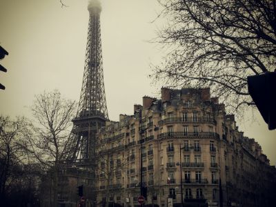
كيف تقلب صورة
مثال
<style>
img:hover {
-webkit-transform: scaleX(-1);
transform: scaleX(-1);
}
</style>
<img src="paris.jpg"
alt="Paris">
ملاحظة: هذا المثال لا يعمل على الأجهزة اللوحية أو الهواتف المحمولة.
نصيحة: انتقل إلى برنامج CSS 3D Transforms التعليمي الخاص بنا ، لمعرفة المزيد حول التحولات ثلاثية الأبعاد.
3D انعكاس الصورة مع النص
تعرف على كيفية عمل قلب متحرك ثلاثي الأبعاد لصورة مع نص:
باريس
يا لها من مدينة رائعة
الخطوة 1) أضف HTML:
مثال
<div class="flip-box">
<div class="flip-box-inner">
<div class="flip-box-front">
<img src="img_paris.jpg"
alt="Paris" style="width:300px;height:200px">
</div>
<div
class="flip-box-back">
<h2>Paris</h2>
<p>What an amazing city</p>
</div>
</div>
</div>
الخطوة 2) أضف CSS:
مثال
/* The flip box container - set the width and height to whatever you want. We
have added the border property to demonstrate that the flip itself goes out of
the box on hover (remove perspective if you don't want the 3D effect */
.flip-box {
background-color: transparent;
width: 300px;
height: 200px;
border: 1px solid #f1f1f1;
perspective:
1000px; /* Remove this if you don't want the 3D effect */
}
/* This
container is needed to position the front and back side */
.flip-box-inner {
position: relative;
width: 100%;
height: 100%;
text-align: center;
transition: transform
0.8s;
transform-style: preserve-3d;
}
/* Do an horizontal
flip when you move the mouse over the flip box container */
.flip-box:hover .flip-box-inner {
transform: rotateY(180deg);
}
/* Position the front and back side */
.flip-box-front, .flip-box-back {
position: absolute;
width: 100%;
height: 100%;
-webkit-backface-visibility: hidden; /* Safari */
backface-visibility: hidden;
}
/* Style the front side (fallback if
image is missing) */
.flip-box-front {
background-color: #bbb;
color: black;
}
/* Style the back side */
.flip-box-back {
background-color: dodgerblue;
color: white;
transform: rotateY(180deg);
}